Let’s suppose you were interested to know the demographic of a particular neighbourhood, and so you sent out two survey teams to collect the data.
Survey Team A came back and reported the following:
“A typical household of this neighbourhood is of size 3.”
Survey Team B came back and reported the following:
“A typical resident of this neighbourhood lives in a household of size 5.”

What’d be your reaction to these seemingly paradoxical statements? Is one of them wrong, or could both of them be right at the same time? Let’s find out.
An average household
We will first need to look into the data collected by the teams and then investigate how each of the reported average numbers was calculated.

Team A realized that there are a total of 23 households in this neighbourhood, each having a certain size. Therefore, using the numbers in the first and second columns of Table 13.1, Team A calculated the average as follows:

Team B, however, took a different approach. Instead of treating each household as an entity, the team went deeper and surveyed each of the 69 residents about the size of the household in which he or she lives. Hence, Team B calculated the average using the numbers in the first and third columns:

Having gone through the calculations of the two reported averages, it seems like both teams are right! So what gives?
Two different types of average
One should note that the two averages computed are different not just numerically, but also spiritually. Borrowing terminologies from chemistry, we could say that Team A was averaging at a molecular (household) level, whereas Team B was averaging at an atomic (resident) level.
If you sample the households like what Team A did, the likelihood of sampling a household of a particular size is determined by its frequency in the second column. For instance, in the calculation of Average A, household size 10 weighs 5 times less than household size 2 (2/23 vs. 10/23) as households of size 10 appear 5 times less frequently than that of size 10 (2 vs. 10). Overall, the value of Average A being 3 is just a consequence of the fact that over 70% of the households have size less than or equal to 3.

whereas the green dots represent residents living in households of size 2.
On the other hand, if you sample the residents like what Team B did, you tend to oversample households of larger size simply because, well, there are naturally more members in a larger household. The probability of encountering a resident whose household is of a particular size is determined by the “scaled frequency” in the third column. Going back to the calculation of Average B, household size 10 now weighs equally as household size 2 (20/69 vs. 20/69) because they are each represented by 20 residents. As a result, Average B is numerically greater than A since less than 50% of the residents live in households of size less than or equal to 3.

The inspection paradox
The above phenomenon where there’s a discrepancy between the two average values due to different sampling methods is a case of a mathematical idiosyncrasy called the inspection paradox. Essentially, the sampling method at an atomic level (i.e. Team B’s method) is size-biased, in the sense that the probability of sampling a molecule to which the atom belongs is proportional to its size: the more atoms a type of molecule has, the more likely we are to sample its atoms, and the more overrepresented the molecule is.

but there are 2.5 times as many yellow atoms as blue atoms.
Is every car either too fast or too slow?
Interestingly, the inspection paradox is closely related to some of our daily life experiences. If you’ve ever driven long distances on a rather empty road, you might have realized that most of the vehicles you observed were either significantly slower than yours (and so you overtook them) or significantly faster than yours (and so you were overtaken by them).
The illusion that you never see any vehicle moving at a similar speed as yours is basically the inspection paradox at work. Indeed, the likelihood of you observing a new vehicle is proportional to the speed difference between your car and the vehicle. In particular, imagine that there’s a car ahead of you which is still out of your sight at the moment. If it is travelling at exactly the same speed as your car, you will never be able to catch it up and register it on your radar. Simply put, in this manner of observation, cars travelling at a similar speed as yours are underrepresented, whereas cars travelling at a significantly different speed are overrepresented.
Is your bus always late?
Here’s another instance where the inspection paradox may be present. Suppose you take the bus to work every morning. According to the bus company, the average inter-arrival time between two buses is 10 minutes, and so the average waiting time is 5 minutes. In a non-ideal world, you know that there will always be deviations from the averages – sometimes you wait for less than 5 minutes, and other times more than that – but you’d expect the average waiting time you experience in the long run to be quite close to 5 minutes.
As a frequent rider, however, your experience says otherwise. More often than not, you find yourself waiting for more than 5 minutes, so much so that (if you’re serious enough to do the math) you realize your average waiting time is close to, say, 7 minutes. So, did the bus company lie about their statistics, or was your luck simply bad enough?
The truth may be neither. As mentioned earlier, in reality there will be deviations of the inter-arrival time from the average, resulting in various time intervals of unequal lengths that still average to 10 minutes. If you show up randomly at the bus stop in the morning, you are more likely to find yourself in a longer interval than a shorter one. And the more unequally distributed the interval lengths, the more overrepresented the longer intervals.

From whose point of view?
The above examples show that perspective matters in statistics, just as it does in many other areas. Adopting a different point of view often results in a different sampling method, which may in turn yield a numerically different statistical finding.
In the context of the inspection paradox, neither of the two averages is more accurate than the other: they are just two different pieces of the same puzzle. If we take the perspective of molecules, then the result of our calculation tells a story about the average molecular size that agrees with Team A’s finding. On the other hand, if we’d like to emphasize the atomic experience, then Team B’s method provides the necessary viewpoint.
Unfortunately, failure to consider different points of view leads to more than just mathematical paradoxes. It can also cause people’s confusion at best and their frustration at worst.
To illustrate this point, let’s suppose the maximum capacity of a train is 800. One day, the railway company received an abnormally large number of complaints from the train passengers about their unpleasant experience due to overcrowding. Curiously, the data showed that there were a total of 1000 passengers and 4 trains during the period of incident, meaning the average number of passengers per train is 250, far below the maximum capacity. So it seems like a classic case in which the service provider is perplexed by complains that contradict the statistics… or maybe not.
In fact, overcrowding is a telltale sign that the inspection paradox might be lurking around. Upon closer inspection (no pun intended), this is what happened:

As shown by the figure, the first three trains were quite empty: each of them only had 100 passengers on board. The fourth train, however, almost hit the maximum capacity with its 700 passengers. Therefore, if we were to survey this group of people, 70% of them would experience overcrowding, while the lucky 30% would actually enjoy a much more comfortable journey. On average, a typical passenger from this group will be on a train with
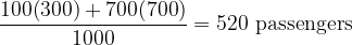
which unsurprisingly is a higher value than the other type of average mentioned earlier (i.e. 250). So, there really was an issue the railway company ought to look into.
Perhaps the main takeaway of the discussion is that even simple statistical concept like average can be subtle and misleading at times. When presented with any statistical data, one should avoid taking them at face value and jumping the gun. Remember, numbers do not substitute for reality – they only summarize it.


